iOS 11 preview
- jun
- 26
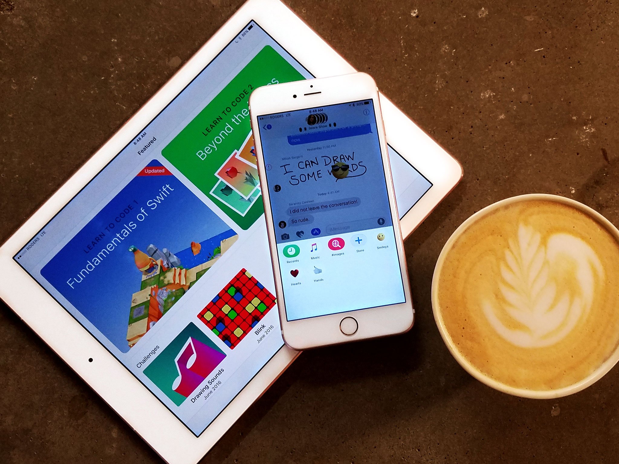
Drag and Drop. Files.app. Enhanced intelligence and learning. Peer-to-peer Apple Pay. A new App Store design. Augmented Reality. And more. Much more. This year Apple takes iOS to 11 — but how well does it get there?
10 years ago, Apple shocked the world and shook up the industry by unveiling of not just the iPhone but of what became known as iOS — the mobile, multitouch operating system that powered it. iOS combined engaging design, delightful animations, and intuitive gesture interactions with a real web browser, real apps, iTunes sync, and a multitasking demo that left the crowd — and a Starbucks employee on the other end of the biggest latte order in history — speechless.
Since then, Apple has added third-party apps and innumerable new features, and both directly and, through inspiring others, made computing accessible to billions of people.
Taking all that to 11 is an easy line but not an easy job. Many of us count on iOS to keep us connected, informed, entertained, on time, in the right place, and with everything we want and need, every moment of the day and night. It's what ties us to our friends and families, locally and around the world, and lets us do our jobs and have our fun. It's become our external memory and our life accelerator.
To keep iOS moving forward without leaving people behind, to increase productivity, creativity, efficiency, and convenience without adversely affecting approachability and inclusivity, is — I was going to say "balancing" but "juggling" feels apt — an exquisitely tough juggling act. Especially when upwards of 85% or more It involves staying focused while avoiding tunnel vision, and solving problems in a way that goes beyond the expectations and implementations of the past to deliver new and improved features that are truly meaningful and impactful now and into the future.
No pressure.
To accomplish it, Apple is doubling down on smarts. What started a few years ago with sequential inference and proactive interface is now using all the artificial intelligence, machine learning, computer vision buzzwords — and the technologies behind them — to bring more information and more features to us, hopefully before we even know we need them.
iPad is also going even more pro. After largely sitting out last year, this year it's getting its biggest update ever — drag and drop multi-window interactions reimagined not just for multitouch, but for a level of multitouch beyond anything Apple's been willing to unleash before. And it's all at the system level, so iPhone benefits from it as well, if minimally for now.
There's also all sorts of other goodies, like direct mobile commerce through peer-to-per Apple Pay, a one-handed keyboard for iPhone, document scanning in notes, markup for screenshots and the web, a new Siri voice and intelligence, new photos filters that can get "depthy" with it, indoor maps for airports and malls, HomeKit support for speakers, multi-room capable AirPlay 2, Apple Music social sharing, a whole new App Store, FaceTime captures, automagic setup, and more.
Here's your first look.
About this preview

I installed iOS 11 on my primary iPhone 7 Plus and iPad Pro 9.7 the moment the developer beta became available, because of course I did. Since then I've used it day in, day out, and recently beta 2, which is essentially the same as the first public beta, on both devices and on the new iPads Pro as well.
Since it's a beta, I'm not going to talk about bugs. Finding bugs so Apple can squash them before release is the whole purpose of a beta. Lest that gives you a false impression about just how awesome iOS 11 is on your main phone or tablet right now, let me just say this about that: It's a good beta but it's still a beta. So, if you need your iPhone or iPad to be fully predictable and dependable all the time, so you can call for help or nail that presentation, wait for release or for the first update post-release. Disclaimer time.
Apple occasionally offers updates to iOS, watchOS, tvOS, and macOS as closed developer previews or public betas for iPhone, iPad, Apple TV and Mac (sadly, no public beta for the Apple Watch). While the betas contain new features, they also contain pre-release bugs that can prevent the normal use of your iPhone, iPad, Apple Watch, Apple TV, or Mac, and are not intended for everyday use on a primary device. That's why we strongly recommend staying away from developer previews unless you need them for software development, and using the public betas with caution. If you depend on your devices, wait for the final release.
iOS 11 Design
iOS 7 was a major redesign. The photo-illustrative, metaphorical interfaces of the past, rich in texture and affordance, were set aside for more digitally authentic, physically playful look.
With iOS 10, scuttlebutt has it a designer working on the services apps — Apple Music, Maps, Home — came up with a bigger, bolder, variation, including large titles and layered card views.
The goal was to better orient people, especially in apps with a lot of content.
Back in the old days of iOS, you could be disoriented and still realize you were in Messages contacts rather than Find My Friends contacts or Game Center contacts, for example, simply based on the texture. Sounds silly, but it could mean the difference between texting a friend for help and pinging them with a challenge.
Large titles, which have now spread to other apps like Mail and Photos, help solve the same problem — they let you know right up front where you are. Unlike the heavy textures, though, once you know that, they shrink down and get out of your way.
It's all part of the "way-finding" Apple's focusing on iOS 11. Inspired by airport and street signs, iOS 11 wants to show you where and where you can go.
They're not used nor recommend everywhere, especially not where they would compete with rather than contrast against, the content. But where they are used they work extremely well.
So does the new typographical hierarchies. Where iOS 7 introduced a lot of light font work, iOS 11 is getting heavy. Sometimes may too heavy. (Though we're still in beta, so just as Apple made iOS 7 a little less light, hopefully the company will make iOS 11 a little less easy.)
The core idea is terrific, though. Instead of just size or color to distinguish informational levels, Apple is now using and recommending a mix of position, size, weight, and color.
In general, headers are on top, bigger, bolder, and darker and supporting text is underneath, smaller, thinner, and lighter.
It results in much faster acquisition and much higher legibility, and much better balance against the content.
The new App Store design in particular looks especially great. The new Today view really stands out. Unfortunately, the new App Store, specifically the update page, is the only place the new design language exposes it weakness — the lack of content to contrast with, and the expanded content hints, combine to make it bitsy and harder to acquire, read, and navigate.
Apple is also improving contrast in other ways. For example, filling in button shapes, increase the size of fields, and making glyphs both heavier, thicker, and also better filled.
It makes for better affordance and better legibility and is absolutely the best expression of post-iOS 7 design we've seen yet.
iOS 11 Notification Center and Control Center
Both Apple's pull-down and pull up have been significantly changed in iOS 11. The goal was to provide for a more intuitive, discoverable, and consistent appearance.
For Notification Center, it's essentially been replace by Lock screen. Pull down and you see Lock screen, but with notifications that persist now instead of being blown away the moment you Touch ID into your device. (If you're waking your device from sleep instead of swiping, there's a brilliant — or rather deep, inky dark — animation that looks like the clouds of midnight being driven from the screen.)
To the right (plus one) is still Camera and to the left (minus one), still Siri suggestions, but that's now identical regardless of whether you started on the Lock screen or pulled it back down from the Home screen or from within any other app on your device.
That absolutely makes for a more consistent experience, though even after a few weeks it still looks and feels odd to me to swipe down the Lock screen. Maybe I'll get over it or maybe it needs some subtle differentiation so I don't just know where I am but how I got there.
Control Center is an even bigger though less jarring change. Swipe up from the bottom and you get a single pane again. No more iOS 10-style multi-pane layout to swipe through horizontally.
I'm guessing enough people either never figured out or forgot those extra panes existed that Apple had to call a mulligan and go back to the unified sheet.
To fit everything in, though, Control Center now fills the entire screen on iPhone, much like Notification Center always has. On iPad, it fills the top right of the new App Switcher. And the controls themselves… they're everywhere.
While other elements of iOS have gotten bigger and less informationally dense, Control Center is the opposite. It's denser than ever. You can even customize it now — I'll wait for the "finally!" — so you can have more and different controls. That includes items from almost everyone's wishlists.
And 3D Touch pops you into even more, even deeper options too. For example, the entire Now Playing and Home panes are now contained within the 3D Touch actions of the audio controls and the Home icon. Discoverability is always a concern with that type of interface but enough is surfaced, and 3D Touch has been around long enough, that it should work for most people.
As useful and convenient as it may be, though, it's fussy and not yet very pretty. I'm not sure Apple can do much more with it this year, and it's undeniably a better solution, it just doesn't feel solved yet.
iOS 11 Drag and drop
The biggest feature not introduced last year was drag and drop interactivity, especially for iPad. It was rumored, it was longed for, but not matter how often people said it was coming, it never arrived.
Until now.
Using it, I can see why Apple took its time. This isn't drag and drop grafted from macOS to iOS. This is drag and drop born for multitouch. A lot of multitouch.
For a long time Apple has been incredibly conservative, almost mystical about how it used multitouch. Instead of using the multitouch field to enable tricks like hover states, Apple used them to detect which fingers were being used and reject incidental contact. Instead of creating gesture incantations traced by five to ten fingers, Apple kept to the few really intuitive ones that best reflected direct manipulation.
With drag and drop, though, Apple is starting to let loose.
The technology is built in at the system level, so drag and drop actually works on both iPhone and iPad, although iPhone implements much, much less of it right now. On iPad, you get everything Apple's got.
Touch an element — could be an image, an icon, a text selection, whatever — and it begins to float. Keep touching it and you can drag it around the app and drop it anywhere else that will take it.
Tap other elements with other fingers and they'll be added to the drop stack. Walk your fingers so one touches before the other lets go and you can switch how you're holding the stack.
Start using your other hand, and — holy wow.
Four finger pinch or swipe to change apps, or hit the Home button and pick another app, or use the split view app switcher, or… you get the idea.
But there's more: Tap inside an app to start a new email or new note or bring up a folder or uploader or… I could just keep going.
It's Apple unlocking the full on multi-finger multitouch, and it's glorious.
Complex, yes. Requiring too hands and an iPad set down on a table, sometimes. But glorious.
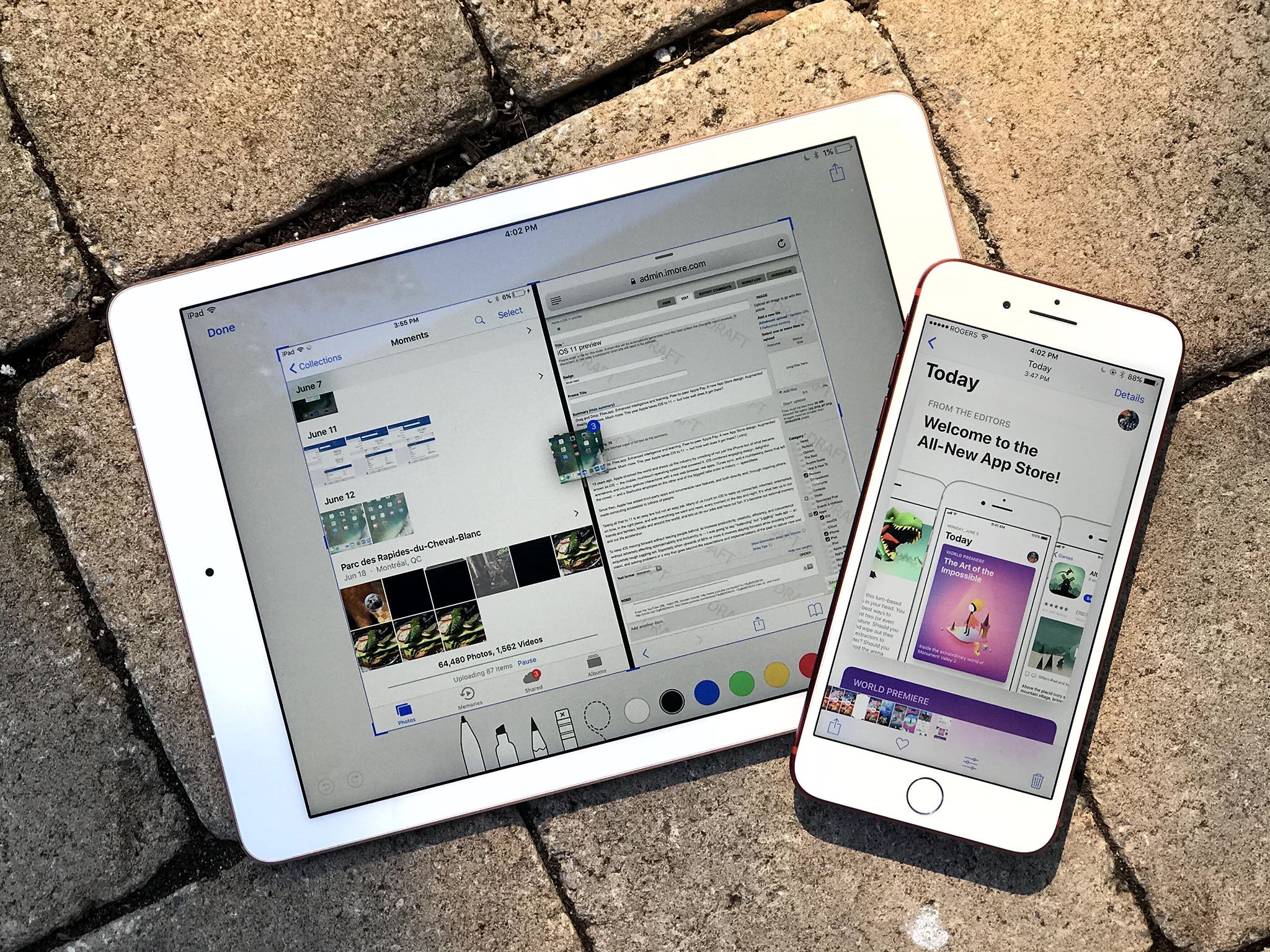
Previously, as my colleague Serenity Caldwell has pointed out numerous times, uploading images from Photos to iMore through the CMS was arduous to the point of being unusable. Now, it's arguably better and certainly more tactile and fun than on Mac.
There are many things I love about Drag and Drop, but this one single-handedly just fixed a HUGE workflow problem I had on iPad: pic.twitter.com/1UuA7DUjqR
— Serenity Caldwell (@settern) June 14, 2017
Even something as tedious as rearranging Home screen icons has been acerbated to point I smile now while picking, stacking, and moving them around.
Only metadata, for example, the type of content you're dragging, is shared with an app you're dragging over. No actual data is handed over unless or until you actually drop it.
That's annoyed some people who want to do things like preview changes on drag enough to call it "drag and secure paste" instead of "drag and drop", but iOS being iOS, it's security and privacy first, last, and always.
No one, except for maybe headline writers, want to see some data harvesting app stealing information when you just happen to be dragging over it.
Using drag and drop is also perhaps the purest expression of Apple's long-stated belief that the Mac should be the Mac and iOS should be iOS.
This isn't the Mac drag-and-drop with a touch layer grafted on top of it. It's not trying to drag the past into the present. It's letting the past go so it can build for the future.
This drag-and-drop Is touch-native, and it's really, really clever.
iOS 11 Dock and multi-windowing
iPad still hasn't been given its own interface layer the way Apple Watch and Apple TV have. And I'm still curious to see what Apple could do if it decided to deliver on that.
Now that iPad has its own, unique Dock implementation, I'm ever more curious.
Visually, it's a dock in name only now, "floating" above the screen, rounded corners and all. Functionally, it's dynamic and will expand and contract to fit whatever apps you want to stick on it at any given time. It'll also present you with suggested apps and Continuity apps on the right.
Touch and hold an icon and you can pull it out into a new-style slide over, which also floats more than docks, and also has rounded corners. (UIKit can animate corner radius now — celebrate!) You can even swipe it side to side depending on how you want to work.
You can still tap the edge to make any slide over a split view, and you can stack an additional slide over on top of the split view. It works great, especially since the primary app of a split view stays active along with the slide over — and a picture-in-picture video, if you have one running.
After a while, you forget the mechanics and it starts to feels like you're dealing windows like cards onto a table.
And you can swipe up into the new iPad Fast App Switcher. In addition to Control Center, it hosts a new iPad version of Spaces from macOS, where you can see your most recently used side-by-side app pairings, and quickly go back to not only what you were doing but how you were doing it.
It's sublime and makes the version introduced in macOS over a year ago, and neglected ever since, seem absolutely primitive by comparison.
Combined with drag-and-drop, it's not just incredibly productive, it''s incredibly fun. And that's what great interface should be.
iOS 11 Files
I've been asking — nay, pleading — for a Files.app each year, every year, since iOS 4 made it obvious per-app silos created as many problems as they solved.
Don't get me wrong, traditional comp sci file systems remain opaque and often incomprehensible to the mainstream — which is why so many files get dumped onto so many desktops — but not having a relatively flat, easily searchable repository creates just as much confusion and anxiety.
Photos.app and the ImagePicker have always been a great model for the mainstream. iOS got DocumentPicker a while ago and now, finally, Files.app.
And it turns out to be not only everything I was hoping for but more.
On the surface it's an easy way to see your files and some level of directories (you can nest them but that gets really nerdy real fast), to find them, and to work with them. Thanks to drag and drop, it's also a delightful way to move them around. Folders are aping-loaded, for example, so you can easily drag a file from one right into another — or a sub-folder beneath it.
You can toggle between icon view and list view — no call-back to Cover Flow, alas but for the best — pin your most important content, and tag groups of similar content together. By dragging it over the tag color in the sidebar!
The more part is that Apple has taken a lot of the other silos, the ones that often complicate even traditional file systems, and attracted them away as well.
What you get is a unified view of not just the files local to your iPhone or iPad, but of your iCloud Drive as well. But wait, there's more! You can also hook in other online providers, like Google Drive, OneDrive, and Dropbox and truly see all your files, all in one place.
The default Recents view is, perhaps the quintessential expression of that. All your latest stuff, all right where you can see it. (You can even get to them right from the Home screen or Dock thanks to 3D Touch shortcuts.)
Nothing is copied between storage sources or jumbled together. Each remains in its own distinct place. But you enjoy the efficiency and simplicity of seeing and using them all together.
(I'm tempted to say it feels like Palm's old webOS Synergy approach to communications — and that reminds me how much I'd still like to see that in iOS as well.)
Best of all, Apple doesn't plan to build File.app into iOS, where novice users will tap on it and immediately enter Explorer- or Finder-panic mode. Instead, Apple is offering it on the App Store, just a download away for anyone and everyone who wants it.
And I suspect a lot of people will. Especially after using it.
iOS 11 Camera and Photos
Phones are more cameras and messaging devices these days than actual call-making devices, and Apple is as much a camera company as they are a phone manuafacturer, so how the company chooses to push imaging forward is always important.
iOS 11 continues the evolution of computational photography, where machine learning, computer vision, and a lot of smart programming start to let us produce images beyond what the glass up front is capable of.
Portrait Mode on iPhone 7 Plus is the first mass-market application of the approach that I'm aware of, and iOS makes it ver better with both optical and software-based stabilization to improve low-light performance. (There's nothing sadder than going for depth effect only to be told you need more light.)
Apple has also added support for HEVC (high efficiency video codec — H.265) and HEIF (high efficiency image format) to iOS 11.
The efficiency in the name works out to about 40% over H.264 for video, and 50% over JPG for photos. It comes at the expense of slightly longer encode times but nothing in life, and certainly nothing in imaging, is free. For photos on iPhone, though, I've never noticed a difference.
There's so little content available for HEVC yet that storage efficiency really is the biggest benefit right now. Hopefully that'll change soon, though, and iOS will be ready when it does. Because I know I am.
HEIF, though, has other advantages right in the here and now. Chiefly, it stores multiple assets in the same container.
So, for on Phone 7 Plus using portrait mode, iOS would previously spit out two images, one regular and one with the depth effect burned in.
With HEIF, the depth data for Portrait Mode — or the still and motion elements of a Live Photo — are all bundled together. (HDR data, which is taken from multiple exposures, starts being processed at the ISP-level in the chipset, so that's burned in before it can be bundled into HEIF.)
The advantage to that is most apparent in photo editing, where filters can now apply different effects based on the depth or motion data.
So, for example, the new filters in Camera and Photos, can apply different shades and tones based on the depth data in the photo. New effects like Bounce, Loop, and Long exposure can also transform your Live Photos into fun social videos or gorgeous works of photographic art.
Apple's been steadily improving Live Photos as well over the last couple of years, so the quality you get from the animation is far better than expected.
Likewise, the filters have been rethought not to duplicate what you typically see on social networks but what you'd find in more classic photography: Vivid, Vivid Warm, or Vivid Cool, which play on vibrancy; Dramatic, Dramatic Warm, or Dramatic Cool, which toy with contrast, and Silvertone which rounds out the previous Mono and Noir filters with something a little more high-key.
(That last one will be my new Insta jam. Just saying.)
QR scanning is now supported, for people who value that wort of thing. (I find it a little old-school but those who swear by it swear by it.)
And memories, which was a surprise hit with mainstream users last year, now has several new types, including: pets, babies, birthdays, sportsball, outdoor activities, driving, night life, performances, anniversaries, weddings, "over the years" (aka "this is your life", "early memories" (aka "glory days"), visits, gatherings, and the one that scares and delights me almost as much as pets — meals.
Apple's still keeping manual controls, and more interesting explorations of depth effect, for example, for developers and third party apps, but that's also helping keep Camera and Photos focused, which is a good thing.
Especially when it comes to Faces and sync.
When Apple initially re-deployed facial recognition and tagging last year, the company said syncing would come later.
Well, later is now. And the reason it took so long is that Apple wanted to provide the convenience of sync while maintaining the privacy and security of on-device processing — Apple doesn't want to know who your friends and connections are, and I'm supremely thankful for that.
So, what Apple's doing is interesting. To enable face detection, you have to start selecting people you know and then identifying them. At that point the on-device machine learning and computer vision takes over and starts to add more and more pictures of the identified people to the pool.
When syncing, Apple is only moving over the data you yourself identified. None of the machine learning or computer vision relationships that were built around it. Just your "truth". Then, the synced device rebuilds those relationships locally.
In other words, I tag pictures of my mom on my iPhone, it finds other pictures of my mom on my iPhone to add to her Faces folder on my iPhone. The pictures I tagged are also synced to my Mac, which then also finds other pictures of my mom on my Mac to add to her Faces folder on my Mac.
Apple will have to prove that this implementation works well enough that people who want no part of the massive data harvest that is Google Photos will still find it useful enough to use, and that'll take a while post-launch to really shake out.
Still, privacy is good and options are good, and options for privacy are great.
iOS 11 iMessage
iMessage has a new interface for choosing apps and stickers which I'm still neither here nor there about. It's better than before but still feels like it clutters up the messaging experience. I don't know a better way to solve for the increasingly cluttered messaging experience in general, though. So, I'll just keep holding to hope that even better is still on the horizon.
There are some new screen effects, including echo which lets you set everything from a chicken head to poop emoji to knives to eggplants swirling around the screen. It's as delightful and terrifying as it sounds.
There still aren't any bubble effects for setting a message on fire or freezing it cold, which I'd love to see. And I still wonder how or even if Apple will keep up with Snapchat and Instagram who seem to offer ever-more-outlandish filters weekly if not daily.
Maybe ARKit can help with that?
Some of the biggest news for iMessage, though, is sync.
Previously, each device got its own unique end-to-end encrypted copy of a message that Apple's servers would attempt to deliver for a week or so and then abandon forever. It was great for security but not so great for convenience and consistency. Over time, invariably, some devices would have some messages and others, especially newer ones, wouldn't.
I was curious how Apple would solve this because the last thing any privacy-conscious person — or Apple itself — wanted was some unencrypted web repository sitting online, ripe for the plucking.
It took them a while but, like with Photos, it seems Apple has done it right.
All messages remain end-to-end encrypted and for all intents and purposes inaccessible to Apple. They're merely collected now on the web, in their encrypted form, so Apple can ensure a consistent delivery and experience across your devices.
We'll likely have to wait until Apple's post-release security white paper is delivered and explains the process in more detail, but it sounds like from the moment you turn on High Sierra and/or iOS 11, all your threads will show up on all your devices, current and to come.
It also remains to be seen how well the approach holds up to the scrutiny of the info-sec community, but if Apple is going to stick by its privacy-first policies, it's going to have to stick with delivering on them as well.
iOS 11 Quicktype Keyboard
Apple's doing a couple cool things with the iOS keyboard this year.
The first is a one-handed keyboard for iPhone. It's not the first time Apple's worked on solving for wider phones but it's the first time they've been happy enough with the solution to ship it. And I'm thankful for that. I've been waiting for it for a while.
There's a left and right-sided version, and you can easily to go back to the standard keyboard with a tap. I just wish it was easier to get into and even move around. I'm guessing edge gestures to invoke and switch the keyboard to side mode and from side to side — which is how split keyboard has always worked on iPad — don't scale down as well. Still, I'd love it if Apple could figure it out since I want to move in and out of one-handed mode a lot.
The second is a "flick"-style keyboard for iPad that lets you enter alternate characters like numbers and symbols by simply flicking down on the key.
Even after a few weeks, I still find myself flicking up by mistake. I'm guessing that's because the alternate characters are not only rendered at the top of the main characters but the area I'm writing on is spatially above the keyboard as well.
I'm sure Apple tested both flick up and flick down before deciding down was right but I'd love the opportunity to try that out myself.
Like auto-correct, flicking is something you have to get used to and learn to trust, but once you do you can enter mixed text, including passwords and addresses, faster than ever.
iOS 11 Notes
Notes is my Mind Palace. With Sync. I dump everything I'm working on and want to keep top-of-mind into Notes and shows everywhere so I can find and use it anywhere.
I do wish I could switch it from rich text to plain text mode, because nerd, but otherwise it's one of my-most used apps, I love it, and its great.
Except in iOS 11 it's even better.
Apps have been able to scan and digitize documents for years on iOS, but now Notes has it built in. It doesn't work on highly complex, highly illustrative documents, but for forms and text on a page, it's solid.
If you have an iPad Pro and Apple Pencil, Notes is now even better integrated. You can tap the Lock screen to launch right into Notes.
You can nudge text aside and start drawing inline, and you can easily mingle text and handwriting.
You can even write in English or Simplified Chinese — which I can do at approximately a 1 year old's level! — it can recognize your scribblings and let you search them as though they were text. Swoon.
Even if you don't have and iPad Pro and Apple Pencil, you can still benefit from the new strikethrough and monospacing styles, and from the ability to pin Notes to the top of the list so really important work — like iOS 11 previews! — never gets lost under more recent, if more random, notes.
iOS 11 Markup
Markup started life as a humble extension buried away in Mail. No longer.
Now, whenever you take a screenshot, you can tap the thumbnail (or stack of thumbnails) that linger at the button left of your screen and immediately start marking them up. Same with websites and the new PDF creation action.
It's a great way to give feedback or, you know, send everything from snarky comments to naughty annotations. Who needs InstaSnap, right? Just markup responsibly, please, people.
If you have an iPad Pro and Apple Pencil, you can use Markup more precisely and more easily — simply touch the tip to document in Files or Mail and start making notes.
Making Markup almost ubiquitous makes it almost muscle memory for me, and that makes it almost invaluable.
iOS 11 Apple Pay
I'm lucky to live in a place that's soaking in Apple Pay. I use everywhere I go. So much so that when I can't use it it's like a utility has gone off. Like I've lost power or the internet.
I don't carry cash with me anymore and I barely carry cards. The only exception, of course, has been swapping funds with friends and family. They don't exactly walk around with contactless payment terminals around their necks. Most, anyway…
For that we've had to resort to quick bank machine runs, using PayPal like it's 2007, or relying on a third party service and app, which isn't always available or set up by everyone.
All the while hoping Apple would bring person-to-person payments to Apple Pay.
And now they have. Or, at least, they will be.
I haven't had a chance to try it out yet, which means I haven't has a chance to form a strong opinion about it, but it looks promising. And by that I mean it looks to have Apple's usual attention to both convenience and security.
It'll be intermediated by "Apple Cash", and you'll be able to send and receive money in iMessage and through Siri, all secured by Touch ID.
It might have some of the same problems as other methods, including international availability and requiring other people to also be using it, but Apple's scale generally helps push things out and make them mainstream.
Fingers very much crossed on this one, because I want it yesterday.
iOS 11 Siri
Apple was first to market with a mainstream digital assistant but the company's lack of early focus and acceleration has allowed Google, Amazon, Microsoft, and others to catch up and, in many people's opinions, race ahead.
I still think Apple would benefit greatly from a public-facing VP of Siri Experience who has only one job — to sidestep everyone and everything else and make sure Siri is the best damn assistant on the planet, period. Much as Apple does for physical products like iPhone, and much as Phil Schiller has done since taking up that kind of roll at App Store.
Still, year after year, Apple is steadily improving Siri. This year that includes a new, more natural voice with better inflections and intonations. Support for translations from English to Chinese, Spanish, French, German, or Italian. And, something else I've been hoping for for years — the ability to type to Siri for when speaking is inappropriate or impossible. (Though that's tucked away under accessibility.)
Suggestions has also been expanded to include text in Safari, stories from Apple News, and flight status.
iOS 11 Best of the rest
There's so much more iOS 11 that it'd take a volume to do it justice. (Give me until September.)
Maps is getting indoor mapping for malls and airports. Just a few to start, because the process is arduous, but more on the way.
Lane guidance, light guidance, and speed limits are also being added to navigation — and to CarPlay — hurray.
Speaking of which, there's a new Do Not Disturb while Driving feature that I think is important, especially as more and more jurisdictions pass much-needed distracted driving laws. I'm not sure DND is the right solution, though. It's too cut off which leads me to believe it simply won't be used. Maybe existing is enough, but I'd still like to see Apple do what Google did with Android Auto and make an embedded version of the CarPlay interface available, minus all the infotainment integrations of course, to anyone with a car mount.
HomeKit will soon be able to control speakers — interesting, with the coming of Apple's HomePod — as well as sprinklers and faucets. There'll also be expanded triggers, so you can automate better, and easier accessory setup via NFC and QR codes.
Speaking of HomePod, AirPlay 2 will let you do multi-room audio with a shared Up Next queue. Developers can add support for it to their own services and devices — your move, Sonos!
Apple Music is becoming more social but without any of the baggage that was Ping or Connect. You can simply follow people and be followed, see what friends are listening to, and jam along as you do.
App Store, in addition to its new design, has finally broken apps out from games and ditched the Top Grossing tab, so not only does it look better, it works better.
It's also integrating a new Apple Pay-style system for buying apps which I'm not quite sure about yet. On one hand it makes for a more unified experience but on the other it makes App Store purchases more intimidating up front, which it shouldn't do.
App Store in general deserves it's own review, though. So stay tuned.
News is more personal, smarter, can show video on its widget, and gives breaking news more attention. It's still not available outside its tiny handful of launch countries, though, which is incredibly disappointing. Apple pushed Apple Music out to 100 countries on day one. I'd love to see even a score or two more for news some two years later.
Mail has top hits, which I'm also still not sold on. It's convenient when its engagement engine nails exactly what you're looking for. Trouble is, I'm mostly looking for stuff like order info and fringe emails that I'm least engaged with. I'm a dinosaur, but I think I preferred my raw list of results.
Wi-Fi sharing lets you securely, invisibly pass along your Wi-Fi credentials to your contacts, so they can get online and you can stop worrying about resetting everything when that sketchy cousin or acquaintance finally leaves…
Automatic setup is just as awesome as it sounds. Put a new device next to an old one and you can quickly pair them. Then you can automatically sign in and pull down your data and settings, and otherwise jump start you on your way. It really puts the buddy in the setup.
ARKit will let you play Star Wars chess with Jabba the hut. There's no way to do it justice in just a few sentences, but Apple is making augmented reality tools available to everyone and imagination alone will be the only limit. Already I've seen demos that make me wish AR was IRL.
And the list goes on and on. Like Apple said, it's the biggest update ever, and not just for iPad.
Coming this fall
iOS 11 is in public beta now and will be shipping later this fall. It's a free update for everyone and will run on any iPhone, iPad, or iPod touch with a 64-bit processor. That includes:
- iPhone 7
- iPhone 7 Plus
- iPhone 6s
- iPhone 6s Plus
- iPhone 6
- iPhone 6 Plus
- iPhone SE
iPhone 5s
12.9-inch iPad Pro (2nd generation)
- 10.5-inch iPad Pro
- iPad (5th generation )
- 9.7-inch iPad Pro
- 12.9-inch iPad Pro (1st generation)
iPad Air 2 - iPad Air - iPad mini 4 - iPad mini 3 - iPad mini 2
iPod touch 6th generation
iPad, thanks to how transformative drag and drop will be on that platform, is going to steal the show. But iOS 11 is every bit as important and good on iPhone.
It doesn't have everything — no iCloud multi-user or re-assignable default apps for iPad or GuestBoard or secured apps for iPhone, at least not yet. But it makes iOS more convenient without adding too much complexity, more powerful without hurting accessibility. It focuses on a few core things across a wide range of apps and services and ultimately comes together to do exactly what we've come to expect it to do — help us better manage and accelerate our lives.
The only tough part is waiting for it to ship.